Problem statement: Nais
-
Case
To propose a redesign of the Nais website, where students with permanent disabilities can apply for educational support in connection with their studies at Swedish universities and colleges.
-
Format
10 weeks
Design proposal for the web
-
Basis for design decisions
Meeting with developers
Interviews with the target group
Prototype testing
Research & analysis
-

Primary persona Jens
Based on information from the student support at the university, analysis of data collected from interviews with students with different functional variations, and information obtained from the developers of Nais, we created the primary persona Jens. Jens represented students with NPF diagnoses (neuropsychiatric functional impairment) who became the primary focus of our project. By designing and adapting content for these functional variations, we also covered and facilitated for several other types of functional variations.
-

Secondary persona Frida
Based on the information gathered, we created the secondary persona Frida. Frida represents students with varying degrees of visual impairments and was created to ensure that our design solutions catered to a broader range of disabilities, beyond just neuropsychiatric disorders.
The basis for compiling requirements from the data collection
Designing the website with NPF-diagnoses in mind makes it accessible for most users, including other types of functional variations and those without a diagnosis.
Using short text amounts.
Making the application flow easy to understand.
Providing options to change font sizes/line spacing, contrast, or having the page read out loud.
Priority list:
Application flow (where users can preview all steps)
Assistive features (change font size/line spacing, dark/light mode, text-to-speech, English version)
Requirements and Goals
A number of requirements were formulated and categorized into functional and non-functional requirements. Based on the requirements gathering, interviews with students, and the developers' preferences, usability goals and user experience goals were formulated.
Usability goals:
The application process should be clear and intuitive.
The application should be secure to complete.
The application process should be efficient.
User experience goals:
Users should feel safe when applying.
The user should feel that the system helps them achieve their goal of applying for support.
The user should feel that it is easy to apply for support.
Ideation phase
During the ideation phase, we brainstormed ideas for conceptual models, sketched different types of solutions, interfaces, and icons for the help functions we wanted to introduce. The primary and secondary personas helped us to focus on the target groups we chose to design for.
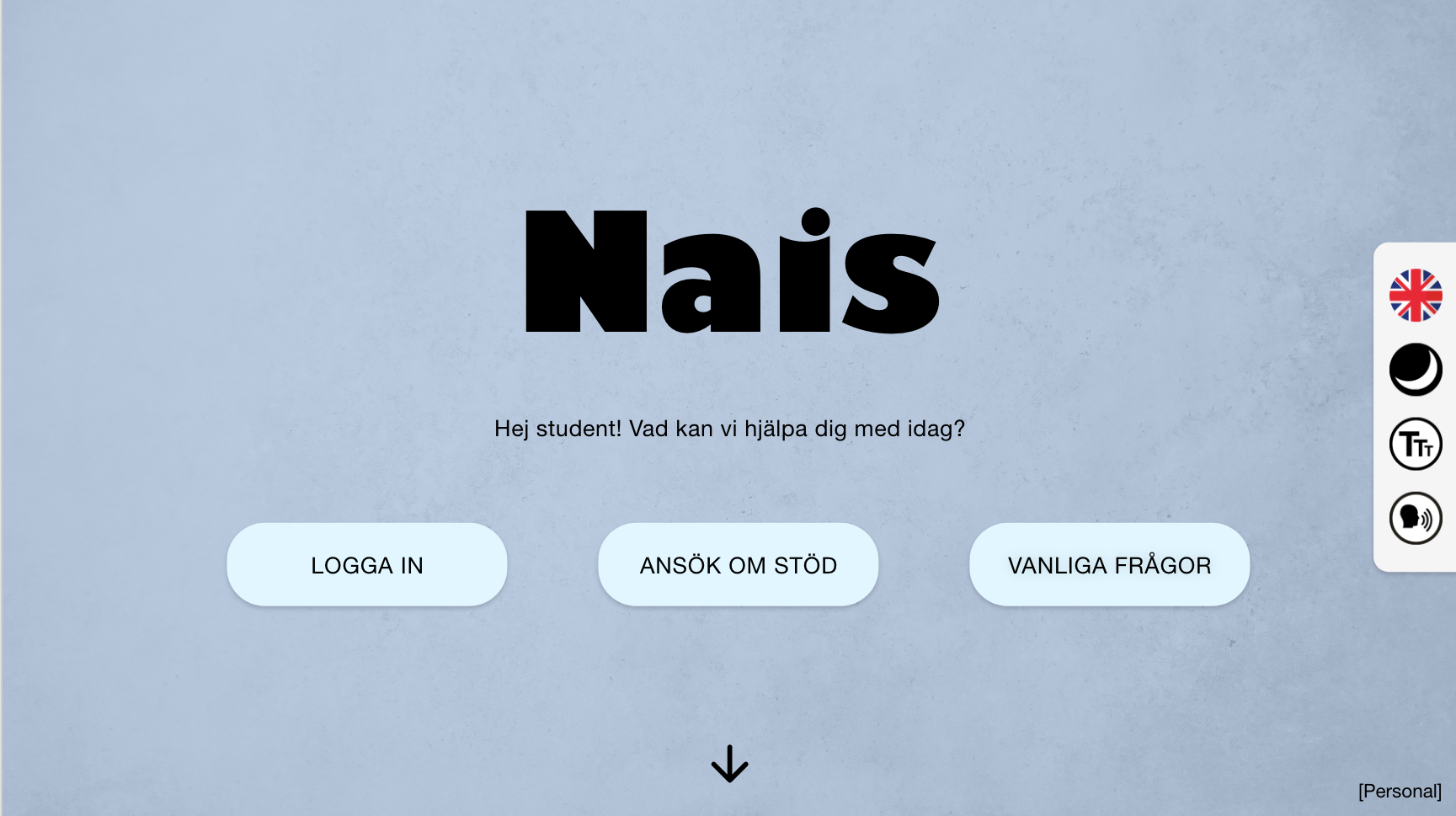
Help functions make the website more accessible to the target group, for example, as additional tools for the different types of needs that the students may have. These functions make it possible to have the text on the page read out loud, switch between dark and light mode, switch between English and Swedish, and to be able to adjust the font size.


Conceptual model
A conceptual model was developed to visualize the interface types we wanted the website to be based on and how we thought activities and user experience goals should be linked. The model also shows the different help functions and which types of interface metaphors we wanted to use on the website.
Prototyping phase
Low-Fi
As a first prototype before moving forward with a digital prototype, we created a low-fidelity prototype made of cardboard to test the design and layout. The video of the prototype was shown to the people we interviewed earlier in the process and they were asked to provide feedback on both the prototype and interface icons.
Mid-Fi
We created the digital prototype in Adobe XD, which was iterated based on the feedback we received on the low-fi prototype. We chose to use a simple and clean interface to reduce the cognitive load that students are exposed to when visiting the site. We also tried to edit and scale down the amount of text on the page. The focus was primarily to let the user see and move freely in the application process so that the applicant has the opportunity to get an overview of the steps involved in the application and how much information they need to fill in.


Application flow
After submitted application
-

Student profile
After submitting the application, the student gains access to their profile page. On this page, the student can view the status of their application and whether they have any unread messages from their coordinator. The student also has the ability to edit their personal and contact information, view uploaded certificates, submit a new application, or log out. The coordinator's contact information can be found on the right-hand side of the page.
-

Message function
In the bottom right corner, there is a messaging feature where the student can contact their coordinator or technical support.
Evaluation & Delivery
The mid-fidelity prototype was evaluated using Nielsen's heuristics, and the problems discovered were severity-rated using the colors green (less serious), yellow (should be addressed soon), and red (risk of error, misunderstanding, and application abandonment).
After addressing the usability issues found, the prototype was finalized, instructions for developers were created, and the proposal was pitched to Nais.


